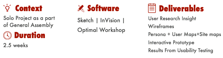
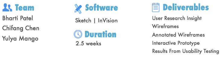
Incorta
Catalog Redesign
Overview
Incorta provides same day analytics for business users to allow businesses to use their data more quickly. It’s engineered to quickly and easily analyzes the massive volumes of data from multiple sources. The analytics platform also provides unparalleled security and mobility.
Challenges
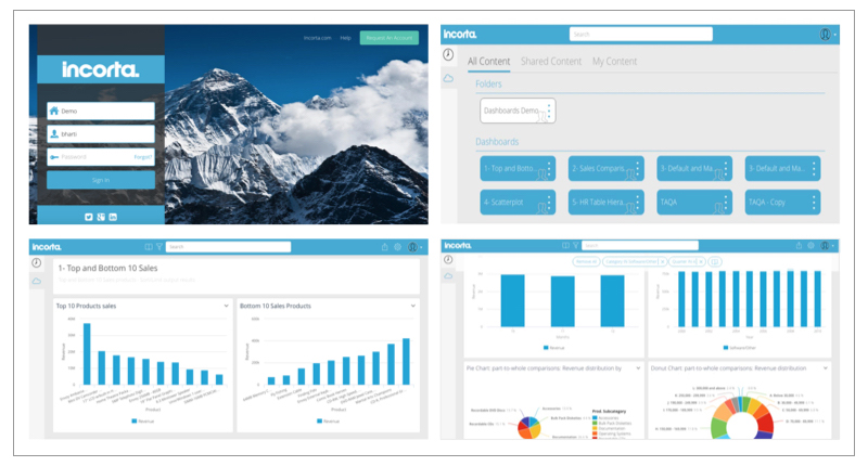
The product performance is exceptional that analyzes massive volume of data in a short period of time. The catalog section of the product, which is the main interaction point with the users, is currently very static, unwelcoming, and offers very little guidance.
Solution
My team, and I provided more engaging, intuitive, accessible and dashboards that, “Tells Stories" so that users can engage with the catalog.
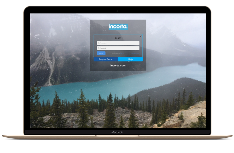
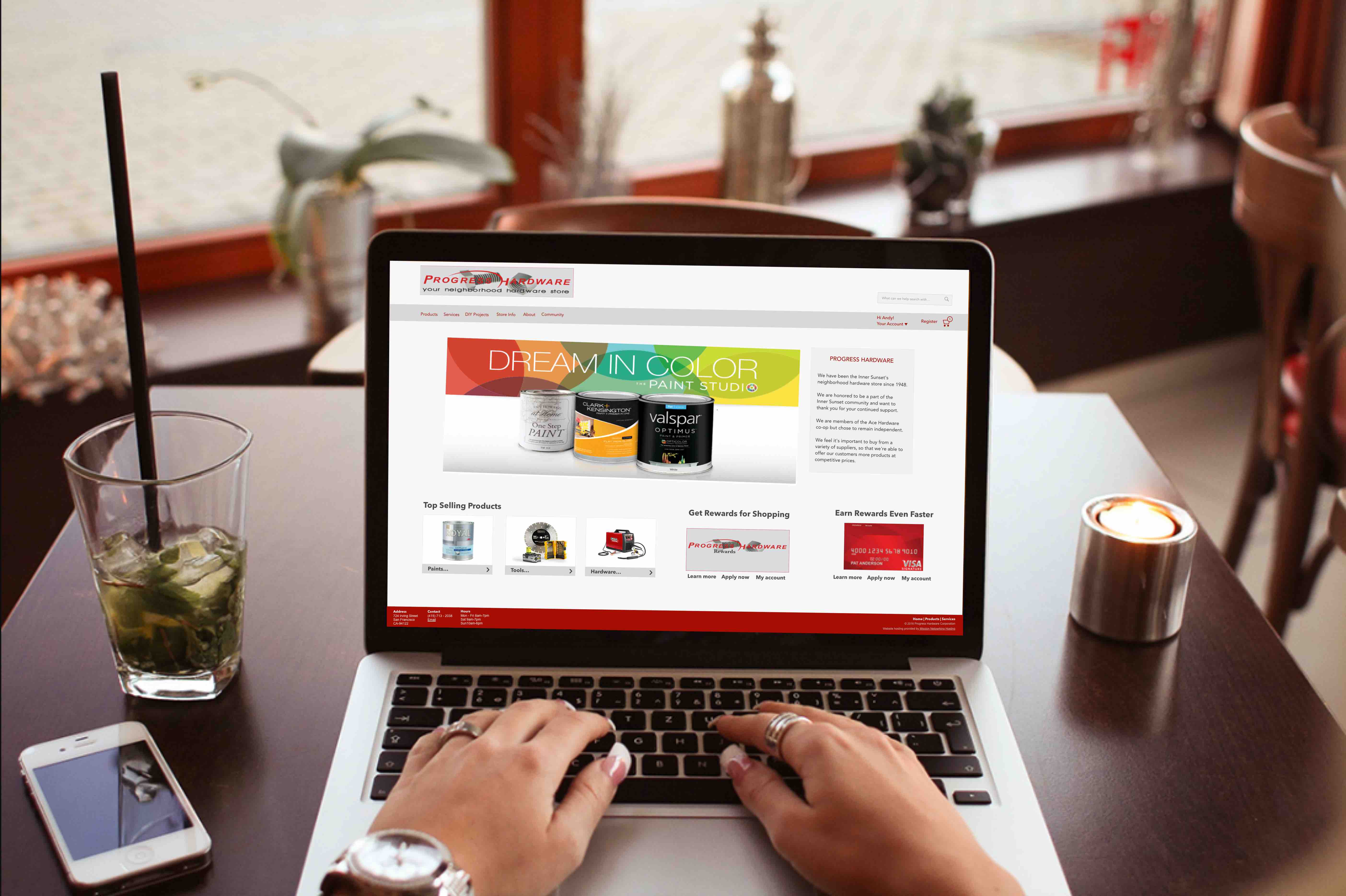
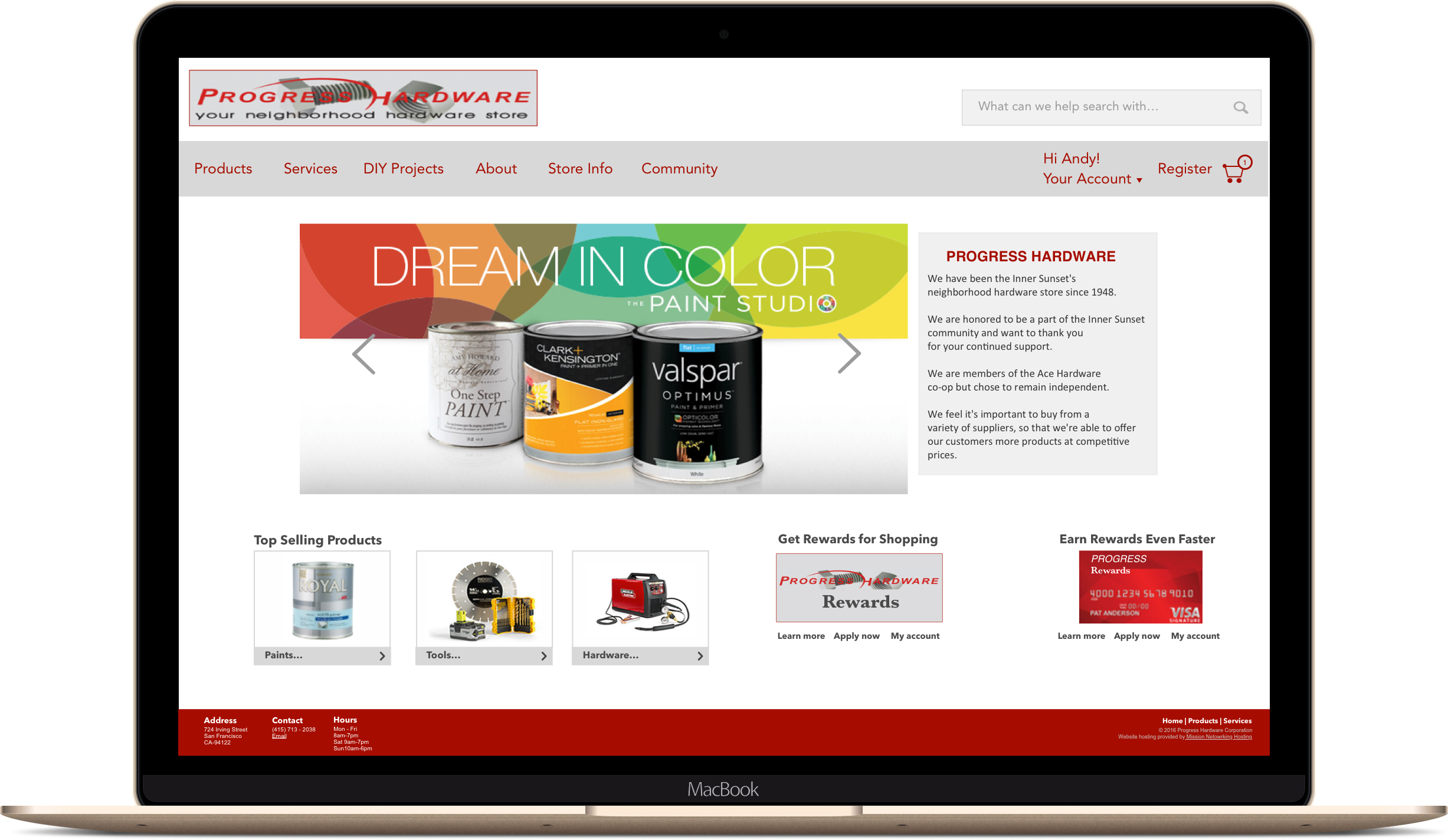
Current Catalog
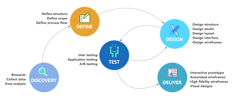
Design Method
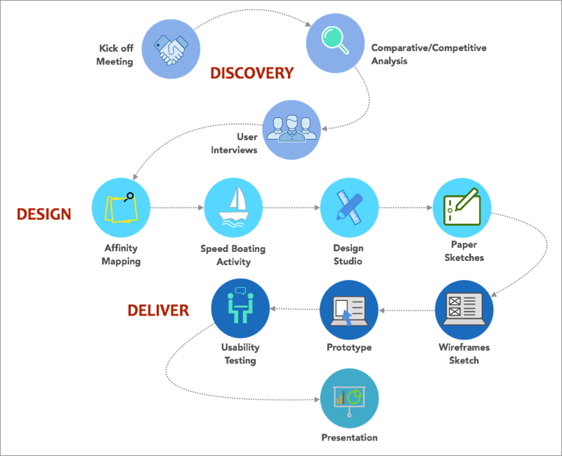
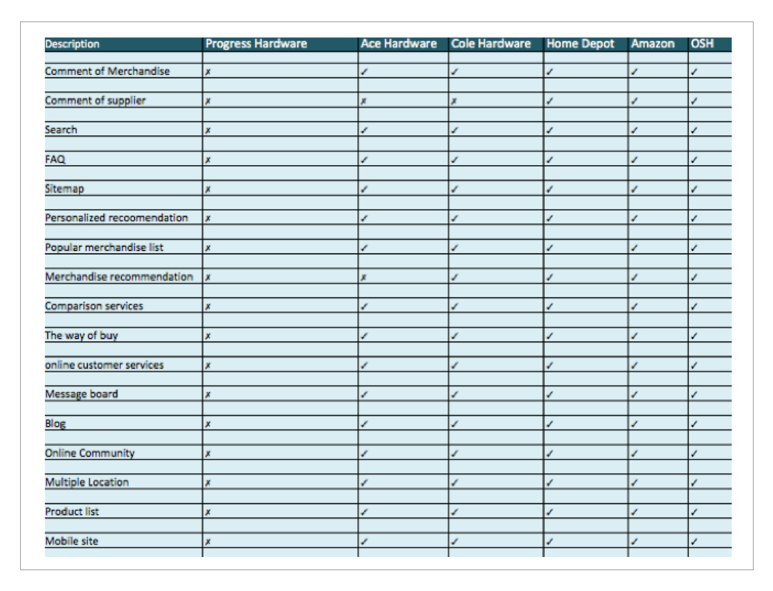
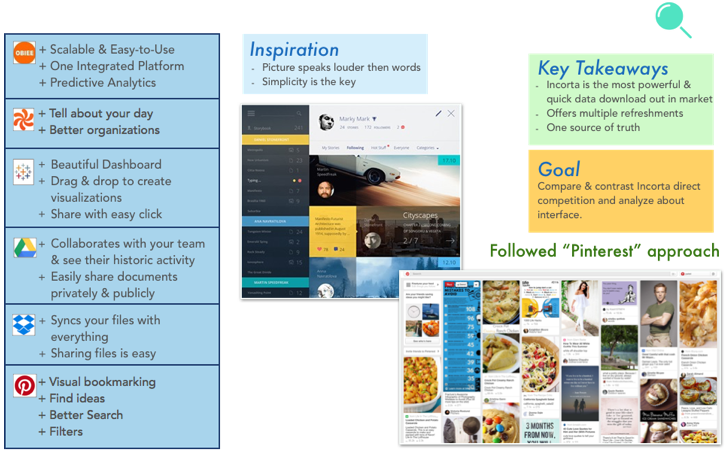
Discovery-Comparative & Competitive Analysis
After our kick off meeting, we got to know the competitors, based on that we did our market analysis and learned about them. But unique about Incorta from all them is that it handles large quantity of data, fast analysis report and simpler accessibility compared to Tableau. Stakeholders wanted similar functionality of Pinterest or Flicker where cards of dashboards are shown “Bundles The Content”.
Discovery-Assumptions
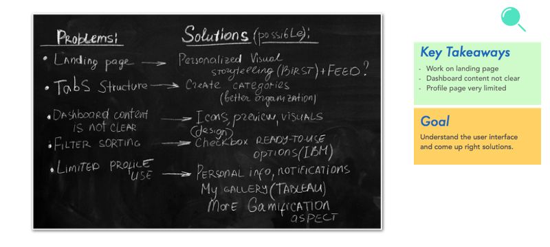
We got access to catalog so we started with heuristic evaluation to get familiar with the interface. We did it so that it could help us understand the key task & scenarios of the users experience. With initial evaluation my team and I came up that we needed more improvement on pages like landing page, tab structures, & search option which was not clear. We got to understand that every user has a different role and access to all the dashboards. Based on this finding, we hypothesized that if we provide a catalog that is engaging it will increase the user interaction.
Design-Connecting Insight
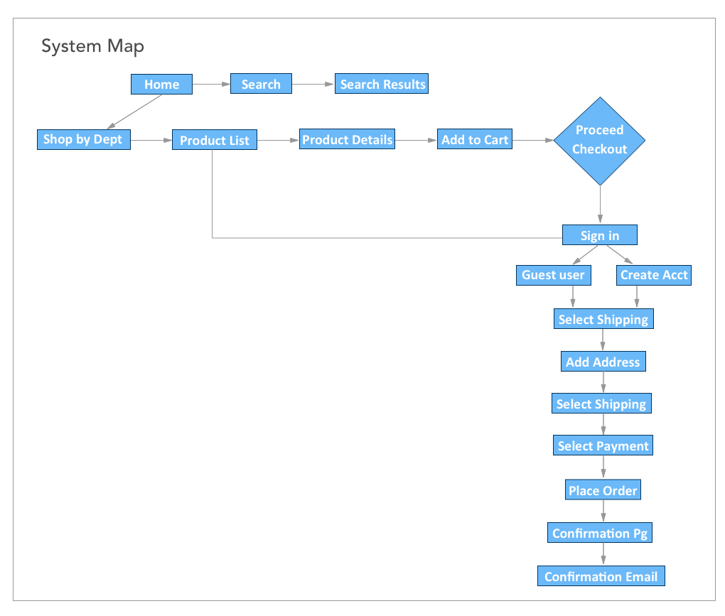
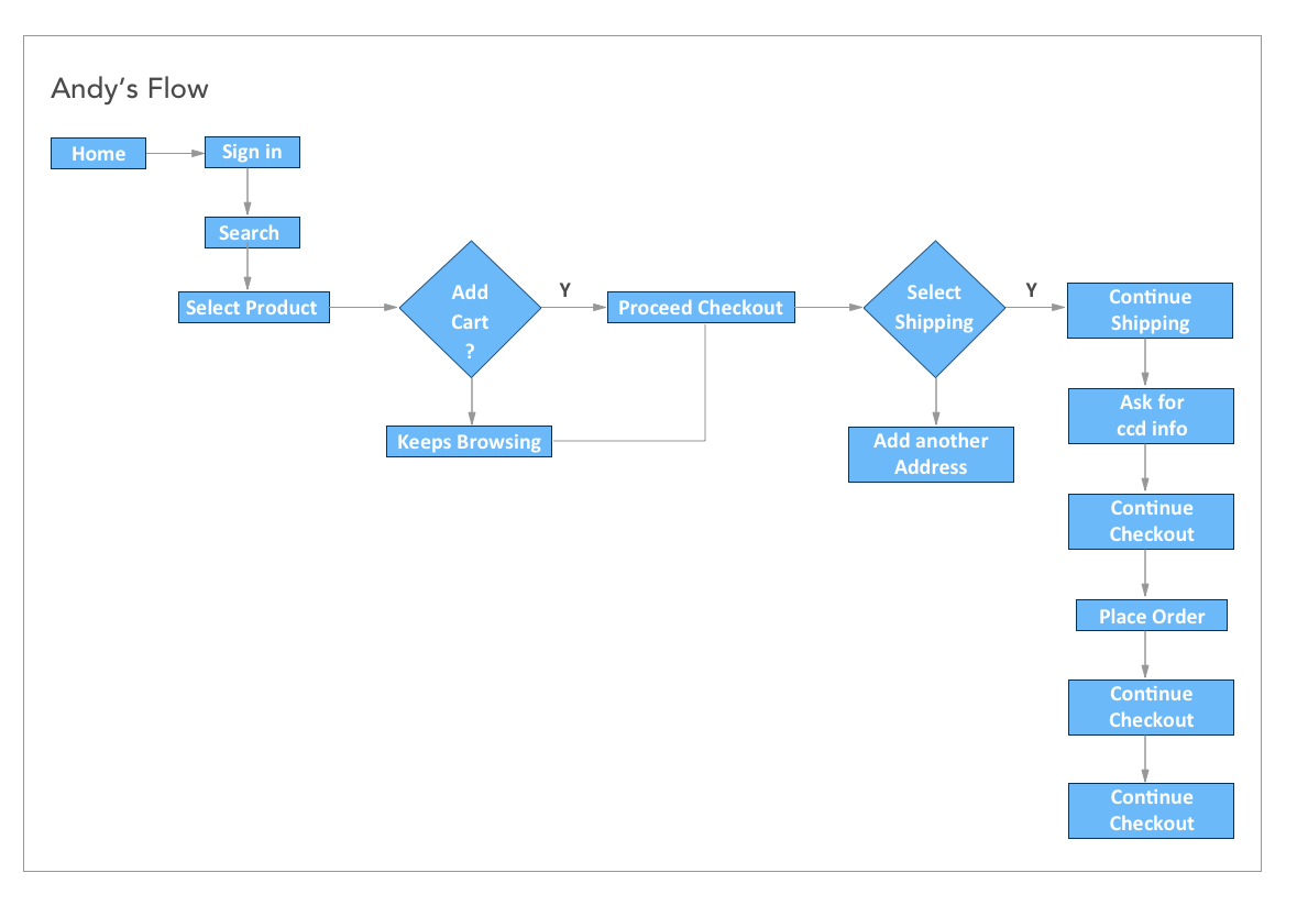
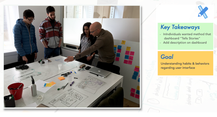
After we gathered all our insights from our interviews we did some “GAMESTORMING” activities Affinity Mapping, its purpose was to reveal the compelling, high-level insight latent in raw data. We collected all ideas and results at most detailed level possible on sticky notes. We invited stakeholders to participate in the design studio, this rapid, iterative approach blends concept creation with critique. It is a great way to jumpstart your design process. Gave them pens and paper to everyone to design their thoughts. That help us better visualize the problem. From that activity we got 3 top features to work on: -Navigation (folder structures) -Descriptions for dashboard -Updates & Notification
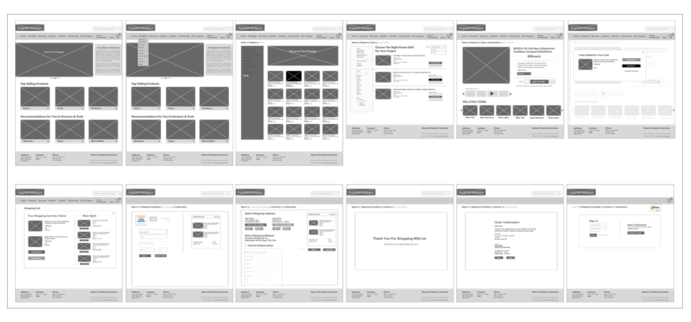
Design-Early Sketches
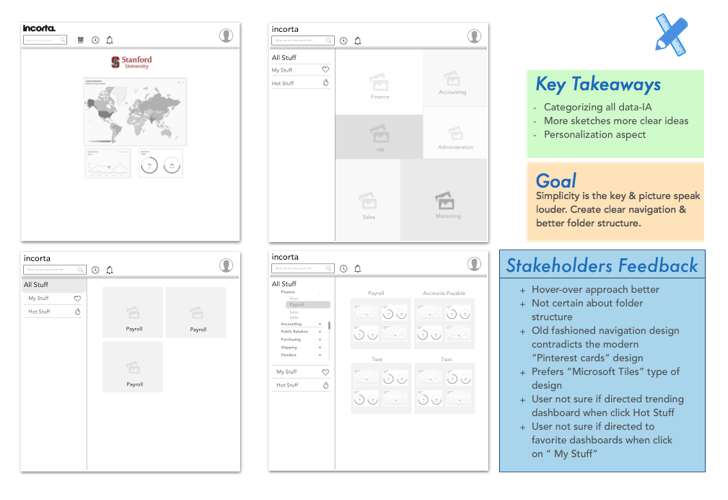
After brainstorming ideas from design studio we started sketching ideas on white board & paper that allows us with different numbers of approaches. After multiple iterations we transferred those sketches into wireframe using sketch tool. We frequently kept updated with our stakeholders and got feedbacks that we integrated in our designs.
Design-Refined Sketches & Testing
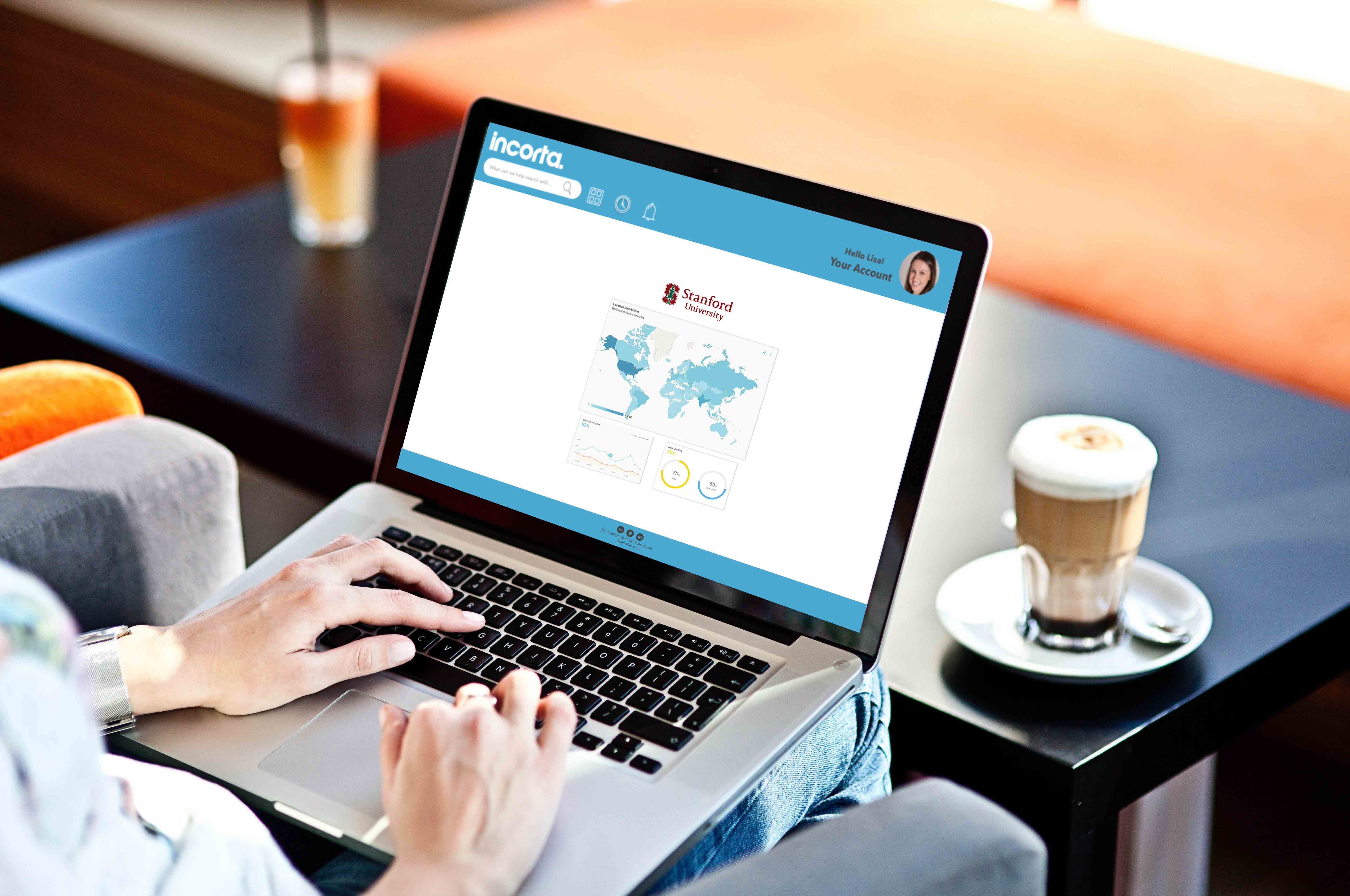
After multiple iteration of sketches it drove us to do the initial prototype, we did our usability testing with the user at Stanford. Feedback from user testing: Needs Stanford brand after user logs in Needs Folder structure changed Need to know what if there are more sub categories After several iteration and usability testing, on initial sketches higher fidelity wireframes on sketch tool was incorporated.
Deliver-Interactive Prototype
After feedbacks and multiple iteration corrections were made from usability tests, we then used InVision to create clickable prototypes.
Results & Reflection
At the end of our two and a half weeks, we presented our findings and recommendations to the client and handed off the deliverables. The Incorta team was impressed by our solutions that we recommended in short period of time. They were really interested in “Mega Dashboard” approached. By streamlining navigation & cleaning up the tab structure helped Incorta catalog look simple & clear. I would want to work on other features, UI & Visuals. I would also perform more usability testing with more users that would helps improve the catalog design.